
Tina Razmjooe
Leg. Tandläkare

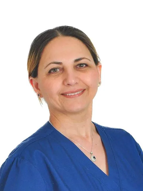
Minoo Jalayer
Leg. Tandläkare
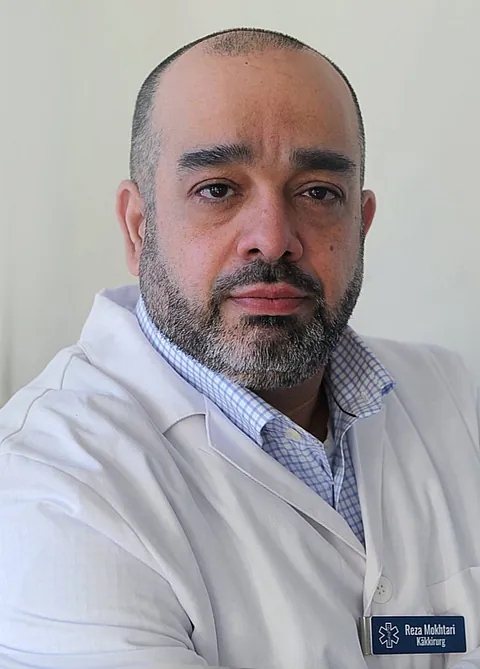
Reza Ardeshir Mokhtari
Specialist i Käkkirurgi
Övertandläkare

RuQaya Al-Mansoori
Leg. Tandhygienist

Frida Almberg
Tandsköterska

Norah Jasonsdotter
Tandsköterska
Tina Razmjooe
Leg. Tandläkare
Minoo Jalayer
Leg. Tandläkare
Reza Ardeshir Mokhtari
Specialist i Käkkirurgi
Övertandläkare
RuQaya Al-Mansoori
Leg. Tandhygienist
Frida Almberg
Tandsköterska
Norah Jasonsdotter
Tandsköterska